Cruise ships polluted oceans with one BILLION gallons of sewage in 2014
The devil’s in the details…
I’m sure that’s gonna be a classic cover!
Lovely portrait photography, kerning and glyph placement on the TIME mag front cover! Some people are saying that the letter ‘M’ was *deliberately* placed…
They didn’t even make Ayatullah Khomeini look that bad…
Who would do such a thing on purpose? Surely not…
Oh well. They can’t ‘unprint’ it now I guess…
Reuters. They’re almost never wrong…
I think my depression has lifted…
Can’t stop laughing…
Sorry…
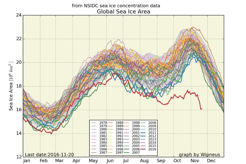
Take a look at this latest graph.
Go on, have the balls to actually look at it:
See where we are? We’re right at that point where we don’t want to be. That’s where we are. The appropriately red-coloured line that is beneath all the others (well beneath).
Look, I don’t claim to know much about climate science. I know about materials science. But if there’s one thing scientists know how to do, it’s to respect others’ areas of expertise. Especially the expertise of other scientists.
It’s a bit like the song:
“What you don’t know you can feel it somehow” — U2
We know that there are others who are cleverer than us. And we respect that knowledge.
So I admit that I don’t know how the Earth’s climate fully works. But this latest graph worries me. This graph worries me a lot.
Because its pretty darn obvious to anyone what is going on in this graph.
I don’t think the Earth is completely screwed just yet. But if we don’t change NOW, then it will be.
I think the Earth’s climate is remarkly resilient considering all we’ve thrown at it over the last century.
But all I know is, if man thinks he can change local environments —on a global scale mind you— without global consequences, well then he is sorely mistaken.
That is not the way this world works. That is not how any world works.
Because this is the graph of all graphs. This graph should be printed on the insides of all petrol tank lids.
Every time you wish to use your car, you should be thinking of this graph!
Every time you want to fly somewhere, you should be thinking of this graph!
Every time you eat meat, you should be thinking of this graph!
This is the “climate emergency” graph that James Hansen is referring to.
And what do I see? In reality? In reality, I look around today, and I see bugger all people talking about this problem. And yet it is a big problem. A very big problem.
People should be talking about this over their lunch break and their coffee break. And for some reason they’re not. They’re just not.
An honest government advert on Adani
- « Previous Page
- 1
- …
- 41
- 42
- 43
- 44
- 45
- …
- 72
- Next Page »