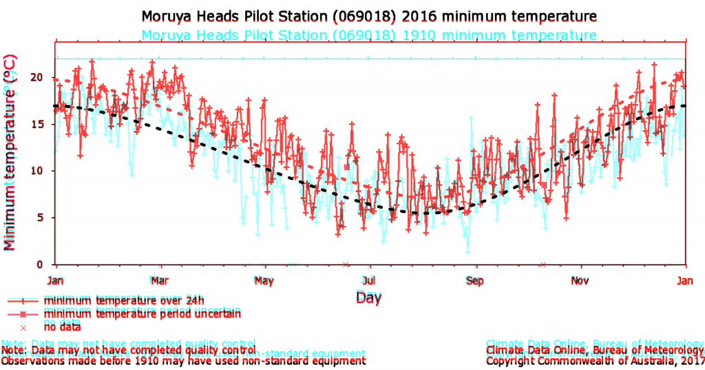
So today I thought I’d share this graph of my nearest weather station in NSW, Australia (well, the second-nearest weather station, because the closest one only has data since the beginning of 2000).
And here it is. Data is from the Australian government Bureau of Meteorology. Moruya heads pilot station. Minimum daily temperatures from 1910 superimpsed with data from 2016. The first year of data compared to the last full year of data. Graphs have been rescaled in the y-axis so that they line up (if they used a consistent scale I wouldn’t have to do this; I think it auto-scales).
Now I have roughly superimposed my own “line of best fit” through both curves (they are both the same height at the beginning and end, as they should be). Yes I eyeballed it. But you can clearly see that the red line is well above the blue line pretty much everywhere.
Now I know this doesn’t “prove” anything because it’s just one weather station of many. And some years are hotter due to the El Niño effect (according to google, both 1900-1901 and 2015-2016 were El Niño periods). But I was curious about something and so I thought I’d personally check it out. [I was originally looking up this very warm day we had on the 3rd of September, 2017 because it was 9°C above average]
Note:
I’ve seen other graphs where people draw their line of best fit and the end tangents don’t match for January and December. I don’t think that is technically correct, because we are looking at continuous trends from month to month and year to year. Where we take the yearly ‘chunk’ of data is kind of irrelevant.
I’ll give you an example: you wouldn’t expect that the temperature for January of 2017 to be significantly different than December of 2016. Likewise, you wouldn’t expect the temperature for December of 2015 to be significantly different than January of 2016. Indeed, we could include these two extra months if we wanted to and look at a 14 month span instead of a 12 month span. But if someone has drawn a wacky curve at the start and finish, and then we include the extra adjoining months, we see that it would be completely wrong.
Therefore, I have inserted the line of best fit through the data so that it matches up at both the start and end of the year. I inserted the minimum number of nodal points (three) and they are ‘symmetrical’. That way, we can expect the temperature fluctuations to continue on from one to the next year and precedes from the last one (without a huge slope at the beginning or end).


